I have been working with a system where one server with clients connected has to send heartbeat messages to another server on behalf of the clients. The heartbeat messages are sent at a 10 minute interval for each client, which means that if the server is restarted and all of the clients reconnect in short order, the heartbeat messages are all sent within a small interval. This isn't a particular problem in and of itself, but it annoys me a little that the monitoring graph is so spiky. Over time the clients naturally disconnect and reconnect which means the heartbeat rate smooths out, but it takes ages.

Can I do better? This post details my idle evening attempts to smooth out the message rate. I have one rule to keep to, although it's not too critical, which is to keep as close to the 600 second heartbeat interval as possible.

Fixed 600 second interval

For completeness, this is my simulated starting point - 10,000 clients all connecting at time 0 and being assigned a fixed 600 second heartbeat per client, leading to a 10,000 high spike every 600 seconds.

Fixed 600 second interval. A graph showing a series of 10,000 high spikes every ten minutes for 6 hours

Adding jitter

A classic approach is to add some random jitter, i.e. adding a random value on top of the fixed interval each time a new heartbeat interval is calculated. This gradually spreads out the clients, depending on the amount of jitter used.

Keeping the jitter low does bring down the peak values a good amount, but still takes ages to have any real effect. This is for jitter in the interval of 0-15 seconds (up to 2.5% of the full range):

600 seconds plus up to 15 seconds of jitter. A graph showing a series of spikes every ten minutes, decreasing in height and increasing in width at a log like rate. Starting height is 700, and by 6 hours the spikes are still around 180 high

Even after 6 hours it's still looking very spikey. I omitted the initial 10,000 high spike which would really mess with the scale.

Using even 300 seconds of jitter it still takes more than 2 hours to truely settle down, and we're potentially up at 15 minute heartbeat message intervals. In practice that would probably be ok, but it doesn't feel right.

600 seconds plus up to 300 seconds of jitter. A graph showing a noisy sine like wave decreasing in amplitude over a bit over two hours, then settling into a noisy signal with offset of around 130 clients

Accounting for the current load

My next thought was to take account of the recent rate of heartbeat messages and use that to modify what the next heartbeat interval would be. The idea being that if we have a high load right now, that implies that in 600 seconds there would consequently also be a high load, so we should push the next heartbeat interval out a bit further. This is nice, because we should only need to use longer intervals when there is a peak load. Once everything is smooth, the heartbeats should be constant. I thought I'd use an exponential load equation to calulate the current load, because I've used it before and it's easy to tweak.

Unfortunately this is again limited by the fact that I don't want to mess with the heartbeat interval too much, meaning that I don't have much scope for modifying each client, and hence can only slowly make changes. This next result shows what happens with one method I tried, where the calculated load is added on as extra heartbeat interval, capped at 300 seconds - too high for my liking, but still producing a too slow result.

Load based calculation of interval. A spike graph with linearly decreasing amplitude, starting at 1000 and decreasing to 380 over 6 hours

Interestingly, if instead of capping at 300 I reset the extra heartbeat interval to 0 when load is too high, the response is much quicker, although still too slow given that this only shows 1000 clients.

All in all, I don't like this approach, it feels like something trying to be too clever.

Load based calculation of interval. A spike graph with linearly decreasing amplitude, starting at 1000 and decreasing to 50 over 6 hours

Random slot based approach

Whilst walking our dog, it came to me that I'd been thinking about this all wrong. With a heartbeat interval of 10 minutes I have 600 different slots that I want to put clients in, leading to a perfect result being 10000/600 = 16.67 clients per slot. If I can get the clients into the right slot in the first place, then I don't need to mess with the subsequent heartbeat intervals.

That leads to this result which is much better, but still not perfect.

Random slot allocation. A somewhat noisy graph with repeating pattern every 600 seconds. Peak of 35 and low of 5, with average of around 16

Sequential slot allocation

If I keep track of what slot I've most recently allocated a client to, I can allocate the next client to the next slot. Easy peasy, why didn't I think of this earlier?

I've cheated a little for this graph, using a total of 12,000 clients so all of the slots are equally full.

Sequential slot allocation. Constant line of 20.

So that's it, all sorted. Well, not quite. This is where my extremely simple simulation hides a lot of the complexity that matters. I've connected all of my clients at t=0 and assigned their next heartbeat time to be value mod 600, with value incrementing by one each time. That works because all of the clients are connecting in the same second, but doesn't work otherwise. If I take this same naive approach when connecting a random number of clients between 0 and 200 per second, we get this result.

Sequential slot allocation. Repeating spike graph with peak of 118 and low of 0, with inter-spike level of 18

What's happening is that I'm using the next slot number to allocate a slot for each client, but without referencing it to an absolute time. In other words, the first slot 0 doesn't necessarily match the next slot 0, and they should.

To fix this, we can allocate the slots so that slot 0 is always absolute time mod 600, slot 1 is always (absolute time mod 600) plus 1, and so on. Result below:

Sequential slot allocation. Repeating spike graph with peak of 20 and low of 16

There is one last thing to consider. it's not really important for the key point of this post, but does show the importance of getting the model right.

The current real implementation uses a linked list to check when heartbeats are due. When a client connects, it is by definition the last client that needs to send a heartbeat, and is added to the end of the list. This results in a naturally sorted list. When the heartbeat check is made, we only iterate over the part of the list where clients need to send a heartbeat. The client is then removed from the front of the list and added back to the back, keeping it sorted.

The simulations I've done keeps the list sorted at all times, which doesn't match what would happens if the next heartbeat time is allocated based on slot, but the client is still added to the back of the list. If we do that, the list is no longer sorted and sometimes clients that should have a heartbeat sent get missed, because they are in the wrong place in the list. Then advancing through the list we get to clients that are overdue a heartbeat, and that manifests as a spiky response.

Sequential slot allocation, unsorted list. Spike graph with peak of 330, decreasing to a peak of 125

Fixing this requires the clients to be added to the list in order which is an O(n) operation, but is only done on the client connection so is not as bad as it could be.

TLDR: I made a game where you guess quadratic/cubic/quartic equation coefficients.

I have a niche project that I'm sort of working on. To simplify it to some degree, it involves matching one curve to another. The existing code is some fairly shonky Python. I'd like to turn it into something web based, and that's not my forte, , so I asked friend and web developer extraordinaire Stuart Langridge for some pointers on where to start. Happily for me, he went above and beyond and gave me a simple working demo, huzzah.

I then turned this demo into something that more closely suited my needs, showed it to some other people and immediately got nerd sniped: "the people on mathstodon would love this".

To that end, I've spent more time than I perhaps should have done turning it into something better (but not necessarily good).

So I present... Coefficiency, where the aim of the game is to match your quadratic equation curve to the target curve, by changing the equation coefficients in the smallest number of moves. Once you've done that, you can move on to the cubic and quartic equations. Finish them? Well naturally it is a daily puzzle with a button to copy some text to the clipboard so you can annoy your friends on social media.

The quadratic case is pretty straightforward, but once you get to quartic it can be pretty tricky to see the small difference between your curve and the target, so there is a mode to show just the difference between the two. It makes it much easier, and adds a * to your score, but honestly I really quite enjoy this mode for the times when you suddenly see the pure linear, x², x³, or x⁴ curve and know you're just one move away from completing it.

Coincidentally, my score for today is:

Coefficiency 📈 2023-05-19 x²:17 x³:44 x⁴:103 https://atchoo.org/coefficiency

On the 19th July 2022, the UK saw a record high temperature set of 40.3°C. In one way, the previous day was more interesting - the electricity grid was nearly unable to match demand. The grid operators were predicting a 70% chance of electricity demand exceeding supply which would then cause blackouts. It's really worth taking a look at the demand curve at that link, it shows how close we were to bad things happening.

A few weeks back, we finally managed to get an export tariff sorted for our solar panels. We're on Octopus Agile Outgoing (that's my referral link). Most export tariffs these days pay something like 5.5p - 7.5p per kWh, which isn't that great when you're paying maybe 27p/kWh to import electricity. Agile Outgoing, by contrast, pays a variable rate which changes every half hour, with the rates published a day in advance at around 4pm. I've only got less than a month of experience so far, but in that time the price per kWh has always been much closer to the import rate.

This is a real consideration if you're concerned about the "financial performance" of your panels. If you're exporting for around the same price as it costs you to import, then there is no real difference as to whether you use the generated electricity yourself, or export it. If it's sunny then it's really rather hard to make use of all of the electricity being generated, so you're going to be exporting - making 5.5p/kWh or 20p/kWh is a big gap.

From what I've seen, there is a fairly typical curve with a peak at around 5-7pm when lots of people are cooking their tea etc. Octopus publish the history of the tariff, so I could go back and look how it has performed and whether it is typical - but I reckon these are unusual times. Either way, that time period isn't great for solar generation.

Back to the 18th, the export rate is shown below.

Agile Outgoing rate for 18th July

There is a half hour period there giving an export rate of around 62p/kWh - or more than double import rates, and it's at more than 50p/kWh for three hours, which is still very nearly double. Yowzers! It certainly worked as an incentive for me, I switched our battery to manual export for the first time ever and drained as much as I could (it has a maximum discharge rate of 2.6kW). I hope I contributed to the health of the electricity network in a small way.

We received our first export statement, covering a period of 18 days. In those 18 days we generated a total of 356kWh with an average export rate of 23p/kWh, for a total of £82. Not bad! If we'd been on a more typical 5.5p/kWh export rate we would've got £20.

We also get a full 30 minute breakdown of exports (in a 21 page pdf), and day by day totals. My worst day was £0.07 and the best day was the 18th July at a mega £10.88. The manual export from the battery accounted for about £2.60 of that. That paid off more than 0.1% of the cost in just one rather exceptional day.

I'm looking forward to getting longer term data so I can get a better idea of how things are going to work out. I am concerned about whether getting solar panels was a good idea from a financial point of view - it looks like the answer is a big yes - but sustainability is a greater concern for me. I'm presenting this post to give others a better idea of the potential financial outcomes.

Around thirty days ago we had solar panels installed \o/. I think it's useful for other people who are thinking about solar to have more information, so this is a bit of a summary of how things have gone for us so far.

Ordering and installation

We ordered back at the end of November 2021 after getting some quotes from local installers and E.ON. These are the rough quotes we got from E.ON (all the quotes include the 5% VAT that was valid at the time):

  • 15x390W panels (5.85kWp): £6400 (37%)
  • 15x390W panels (5.85kWp) plus 5.2kWh battery: £9600 (59%)
  • 11x390W panels (4.29kWp) plus 5.2kWh battery: £8600 (52%)
  • 15x390W panels (5.85kWp) plus 8.2kWh battery: £10400 (63%)

kWp is "kilo Watt peak", the maximum output under certain conditions. The percentages at the end are the claimed potential energy independence, so an idea of how much of the electricity we'd potentially make use of vs export.

The local installer quotes were a bit more expensive, and crucially for us E.ON were offering 3 years interest free credit which made it a lot more affordable and meant we could go with the most expensive option, which otherwise would've been tricky. Given that having a battery and more panels means the payback time should be much smaller, that's a big advantage.

Systems over around 4kWp have to have permission from the Distribution Network Operator (DNO) before they are installed. This application is undertaken by the installers, but could take up to around 12 weeks to be approved - this was a big part of the delay between our order and the installation. There was also a delay of around three weeks because of supply problems getting the batteries from China. That delay ultimately worked in our favour though, because the installation happened after the change to 0% VAT. I dread to think what the lead time is these days though.

The installation itself was pretty straightforward. The scaffolding was erected, including having to block our back door, grr. The same day E.ON told us they were running behind because installers had been off with covid... so we had another week delay, grr. Once they were here though, the installers were great. There were some chaps dealing with the roof fittings on the first day, and an electrician starting the work with the inverter and battery as well. The battery had a small dent in the top and the electrician said that he'd been told not to use it, so we went along with that. He wasn't sure when we'd be able to get a new one, given the delays they'd been having, but in the end managed to get a new one the next day. On the second day the remainder of the DC wiring run was completed, the panels themselves were installed and the full system commissioned. Great.

The only bit that was annoying was when one of the roof installers showed me the panels and pointed out how they'd made the effort to put the panels on the roof so there was still space for another two in the future if we wanted. That was a surprise because I'd thought we were filling the roof completely, based on their measurements. The scaffolding came down the next day, it's unlikely we'll be getting an extra two panels to fill the gap.

The system and data logging

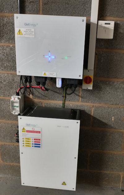
The inverter and battery we have are a GivEnergy Giv-HY 5.0 inverter and a Giv-Bat 8.2. These models are no longer available, there are now gen 2 inverters and 9.2kWh batteries.

This is the inverter (top), battery (bottom), and generation meter (top right):

Solar inverter, battery, and generation meter

The inverter comes with a WiFi dongle that acts as an access point in the first instance, so you can configure it to connect to your home WiFi, to send data up to the cloud. We got access to two mobile apps that use the data - one from E.ON and one from GivEnergy. The E.ON one gives a nice overview of different generation/usage views, and also offers to integrate with other gadgets like controllable lighting. The one from GivEnergy gives a similar view of energy, but also offers some control features about how the battery should be used. There are a few options, the obvious/easy difference is that in Summer you want to charge the battery up in the day and use it at night, whereas in Winter you may want to charge the battery overnight on a cheap rate, then use it in the day when you aren't getting sufficient solar generation.

I have both apps installed, but typically use neither of them. Instead, I grab my own data and save it to InfluxDB. Happily, the inverter has a modbus interface which you can query to get lots of data. Even more happily, some people have already put the effort in to get this working in a very easy way. I looked at two solutions, givenergy_modbus and giv_tcp.

givenergy_modbus is a Python module that allows you to very easily query the data from the inverter and battery and then do what you want with it. I like it because I can write the code to do what I want - logging to InfluxDB.

giv_tcp is a docker image that contains components to query data from the inverter and battery, and then... publish them to MQTT. Yep, this has Mosquitto included in the image, which made me smile.

I believe there is also a "proper" HomeAssistant plugin nearing completion, but I haven't looked at it because I don't currently use HomeAssistant.

The code I put together for using givenergy_modbus is on github.

Family friendly monitoring

MQTT orb, displaying blue

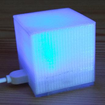
I have a lovely dashboard with all of the data that I'm interested in, but it's not much use for others in the family. I've also got an MQTT enabled ambient orb, and each time I take a measurement from the inverter the colour of the orb is updated. The different states are:

  • Green - battery is charging
  • Red - battery is discharging
  • Blue - battery is no charging (most likely exporting to grid)
  • Pink - we are importing from the grid

In each case, the brightness of the colour indicates the intensity of the state.

The orb sits in the hall where everyone can see it, and honestly I think it's fairly useful during the day at least.
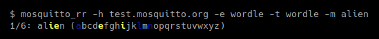
Other logging

I'm publishing spot generation values and AC frequency and voltage values to solar/1d4a3c4f-493c-405a-b7c5-a6c558d2b6ab/# on my test.mosquitto.org MQTT broker.

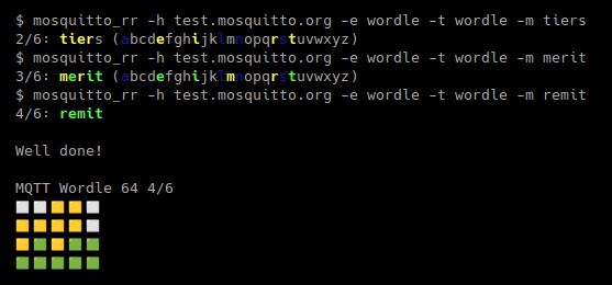
I've also recently set up an twitter bot @ralight_solar to publish generation graphs in a similar manner to @edent_solar.

@ralight_solar image

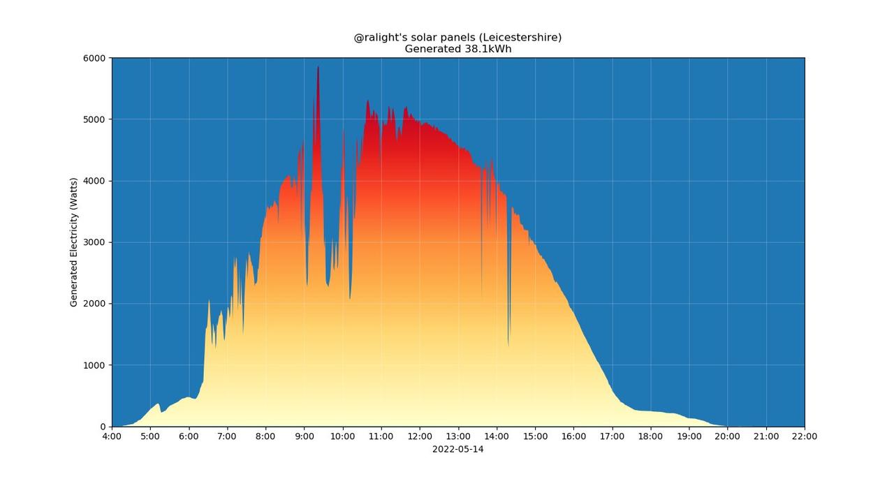
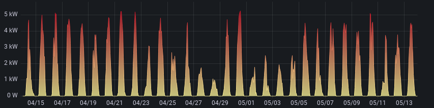
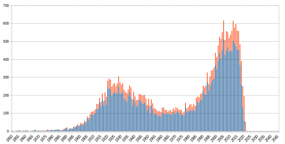
Generation, usage, and export

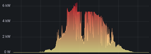
Over the last 30 days we've generated 760kWh in total, with the best generation day producing 38.7kWh and the worst producing 7.8kWh.

This is what generation looked like over that time:

30 day generation output

We've imported 8kWh during daytime, and 62kWh during nighttime.

Our hot water only comes from electricity and we are a large household, so we have higher than typical usage. We used around 470kWh in the 30 days (and barely any gas, by comparison). The numbers are not as accurate here, because the inverter doesn't provide daily load demand figures unlike the daily generation numbers.

It's difficult to make proper cost comparisons because we have an economy 7 meter and so pay different rates during the day and the night, but also because we have changed when we use electricity. Using an average price of 25p/kWh for the day and night, we would have been charged £117.50 without solar (ignoring daily standing charges). The real cost is more like £17.50.

I'd still like to reduce the usage further. We've had a few days with practically zero import and think that should happen more often. The biggest cause of import is still down to hot water during the night. I'd like to get a solar diverter like an iBoost to ensure we get as much generation pumped into the hot water during the day, but I'm not sure whether the solutions that exist right now are enough - I want to be able to guarantee that we have hot water in the morning. If there was sufficient generation during the day then there's no need to turn the hot water on at the night at all. I'm not sure the built in thermostats are good enough for what I want.

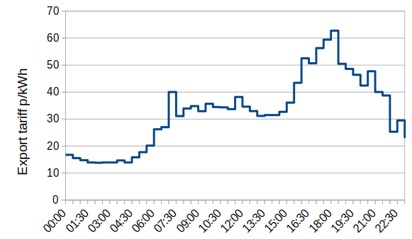
We exported 364kWh. We don't yet have a smart meter so can't easily get an export contract, but if we were with Octopus and on their 7.5p/kWh tariff then that would have produced £27.30.

Total saving for the month, including the unrealised export value would be around £127.30. I'm fairly happy with that.

Limitations

The biggest surprise for me was how the inverter works in different situations. The inverter is rated at a nominal 5kW AC output which is obviously less than our peak 5.8kW output. Our generation is clipped at 5.2kW. This isn't a massive problem, because if we've got that much generation we've already producing more than we'd be using - it does limit the export amount somewhat though.

The exception to this situation is if the battery is still charging. In that case, we can dump 2.5kW max into the battery and still pull up to the limit of the panels. You can see that in this example, where the output is >6kW until the battery charges at which point the output clips.

24 hour generation with high peak

The other slight annoyance is that the inverter can only draw 2.5kW from the battery at once. This is annoying because there are plenty of devices around the home that draw >2.5kW - in particular for us, the hot water immersion. So if we use the immersion at night, it costs money regardless of how much battery capacity is available. Apart from the days where there were very low generation and hence we needed lots of water heating at night time, a great deal of the import we had was from the excess use over 2.5kW, even if the battery still had sufficient capacity. I'm hoping a solar diverter can add a ~2.5kW limit for night use when we get one. In the meantime, I only need ~700W generation to be able to use the immersion during the day, assuming I have some battery charge.

The second gen of the inverter, available now, can draw 3.6kW from the battery, so it's not a problem there.

Battery

We've had 4 days total where the battery was fully drained over night, and 3 days where the battery wasn't fully charged during the day. As we've changed behaviour regarding electricity usage it's very difficult to say, but it's absolutely clear that the addition of the battery makes a massive difference to the benefit we get from the panels.

I want my own solar panels!

Go for it, if you can. One thing to note is that our installers told us there is now huge interest - they're massively over subscribed with orders from their expected plans for the year. So set your expectations accordingly in terms of lead time.

Conclusion

These are the hard numbers from a single month, the real test will be to see how we fare over a full year.

Comments? Reply to this tweet

Wicker Man ride photo

The Wicker Man ride at Alton Towers is a great fun wooden rollercoaster. As is typical, there is a long winding path/queue to the entrance. Compared to some rides there isn't much to look at as you queue, but there are tarpaulins, bunting, bins, and other items that are covered with "rune" writing. A few years ago I took photos of some of the writing and decoded it - it's a simple substitution cipher. Happily, the photos I took included all of the letters A-Z.

My decoder is available in a handy small form so you can use it at Alton Towers: decoder

If you'd like to have a go at finding the messages, you can see the original photos here:

And if you just want to see the decoded versions:

There are a million clones of Wordle, the guess-a-five-letter-word game. This post describes number a million and one, using, of course - MQTT.

Before I describe how it works, here is how to play. The game is hosted on test.mosquitto.org, and you need an MQTT client that can both publish and subscribe, and that can print emoji characters from the payload.

One client that can do this is mosquitto_rr, where "rr" is "request-response". This client subscribes to a topic, then sends a request message to a second topic and awaits a response and prints it out. In our case both request and response topics are the same. The request message we send is our first guess, and the response shows our result:

MQTT wordle round one

You see the round number, out of six, your guess with yellow/green highlighted letters indicating whether the letter was present but in the wrong place or in the correct place, plus the alphabet showing what letters you have used.

Play more rounds using the same command with different words until you win or lose:

MQTT wordle rounds two to four

There is only one game per day per IP address.

How does it work? The code is in a github repo. This implements a plugin for Mosquitto (for the develop branch only) which controls access to the wordle topic and processes messages for it.

The plugin registers to receive ACL events. In the event handler it returns MOSQ_ERR_PLUGIN_IGNORE for topics that are not exactly wordle, which tells the broker it is not handling those topics. For the wordle topic, it allows all subscribe and unsubscribe events. Publish events going to the client are all allowed. Publish events coming from the client are word guesses. Using the remote IP address as a key, we check to see if the client has made previous guesses for this word, to determine what round they are on or if they have won/lost already. This is a fairly crude control mechanism, but the game isn't intended as a serious production ready implementation.

After some data validation the plugin calculates the result, queues the response up to the sending client and crucially denies access to the publish sent from the client. This means we receive the publish it, process its payload and only after we are finished with it do we reject the message so it is not sent to other clients.

There are a few more details, but the ACL handler is the crux of the operation.

The word list was generated with something like:

grep '^[a-z]\{5\}$' /etc/dictionaries-common/words | shuf > words

Chart showing bench inscription year distribution

OpenBenches is a fantastically whimsical site dedicated to crowd sourcing photos and data on memorial benches. Users upload geotagged photos of memorial benches and make sure the text inscriptions are correct.

I've contributed a few benches, but that's not what I'm most interested in. About a year ago I wondered about the distribution of years mentioned in inscriptions on benches. Luckily OpenBenches provide an API to get access to their data in various ways. I grabbed the whole data set (not including photos) in JSON format for playing around with offline.

The JSON file contains an element popupContent which is the inscription, so with a simple bit of Python it's easy enough to extract dates - I'm only interested in the year. Well, actually, no. An alternative title for this post could have been "Falsehoods programmers believe about dates". There are many different ways people choose to represent dates, even in the same text. I'm not exaggerating too much with this example:

In memory of John Smith, born Jan 1931 passed away 2021-01-01. He was mayor of Banslade-On-Sea from 01.01.87 to 1/1/1993 and represented the county at cricket from 01·01·54 til 1:1:60.

In practice this comes up when there are multiple inscriptions per bench rather than in a single inscription, but we don't see separate inscriptions in the data. My crude and nasty matching code ended up with around 150 different patterns for extracting dates. It took a while - but happily some of the odd cases ended up being mistakes in the data that didn't match the original photos, so I was able to fix those.

There are also lots of different ways years are used on memorial benches - beginnings, endings, celebrations of a particular year, or notes of a range of years for example. I have only collected the years mentioned and counted them.

Code available here. Yes, I know it's horrible.

In the original data set I took there were 18236 benches. Today, nearly a year later, there are 22626 benches. 4390 benches added, or roughly 12 benches a day. Of the 22626 benches, 14334 or 63% of them contain a number.

The distribution of counts of the different years mentioned is at the top of the page. The pink/paler part of the bars show the additions in the last year. I've limited the year axis to 1850-2045. There are dates earlier than 1850, but they are fairly rare and including them squashes the main part of the chart. The limit of 2045 is from a bench mentioning when a time capsule should be reopened.

Some of the spikes have particular meaning - 1977 is the Silver Jubilee of Queen Elizabeth II, for example, whereas the spike at 1993 doesn't seem to have a particular explanation.

As a parting note which may be of interest, the large trove of bench photos have recently been used to train a machine learning model for ML generation of benches that don't exist.